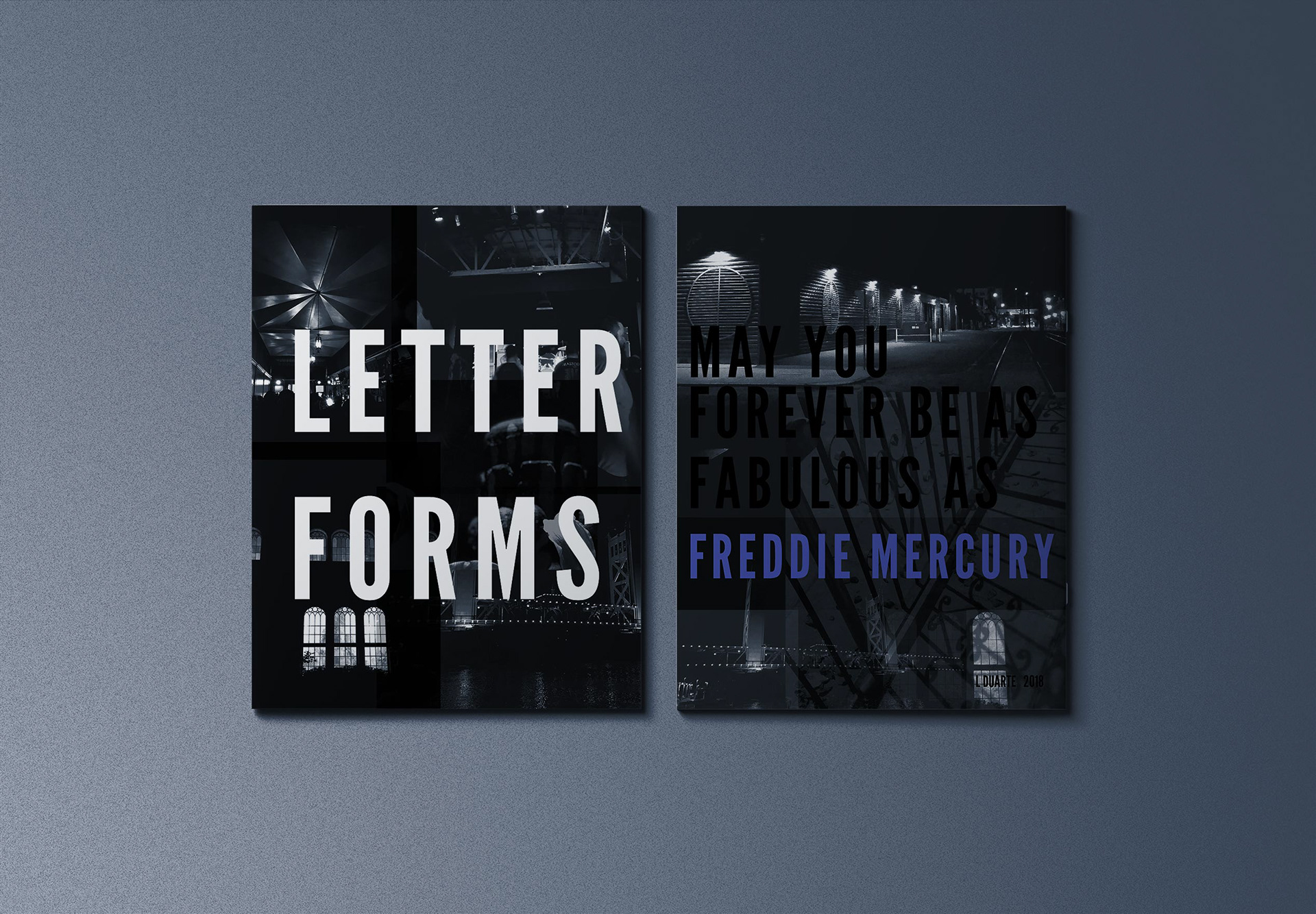
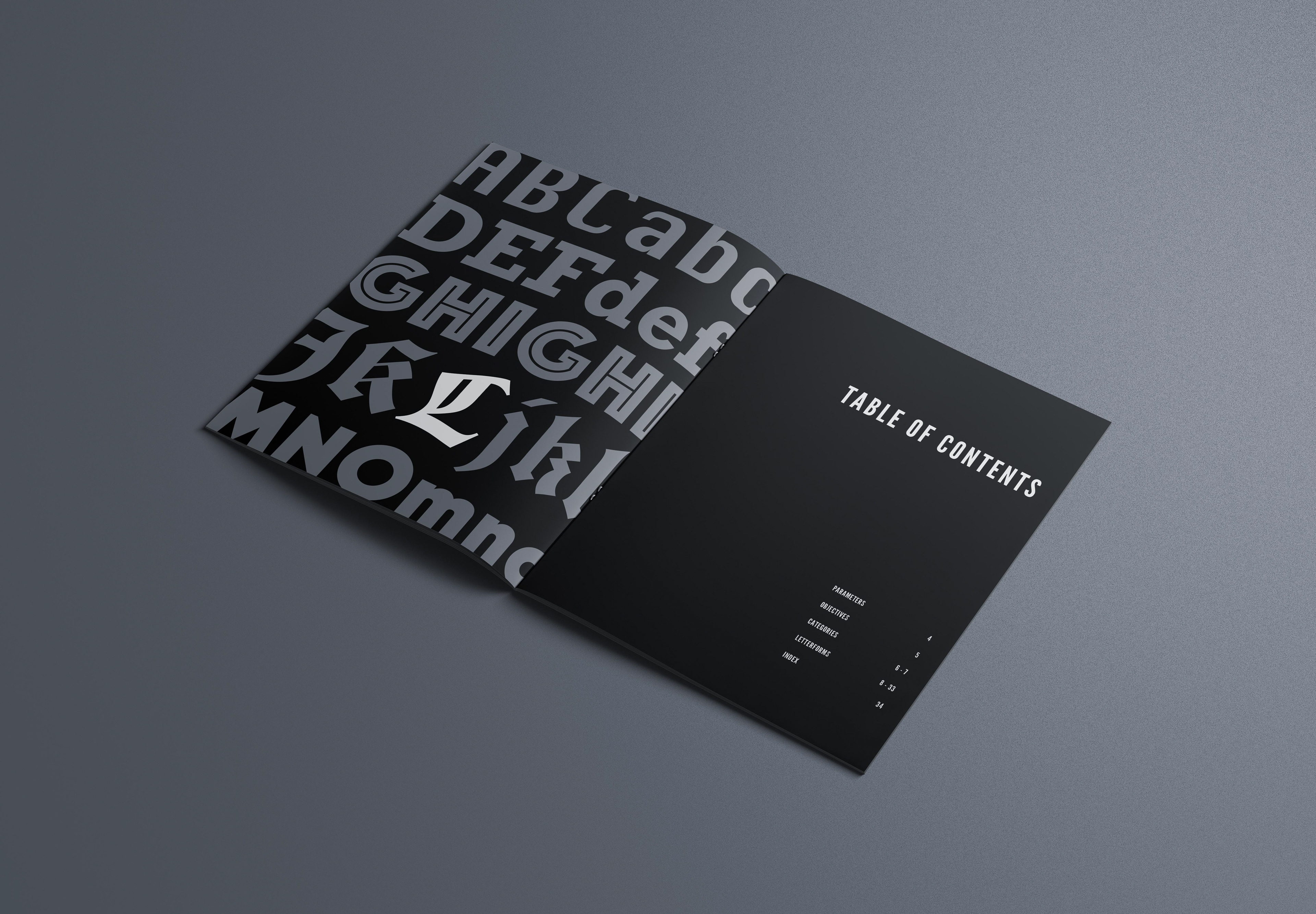
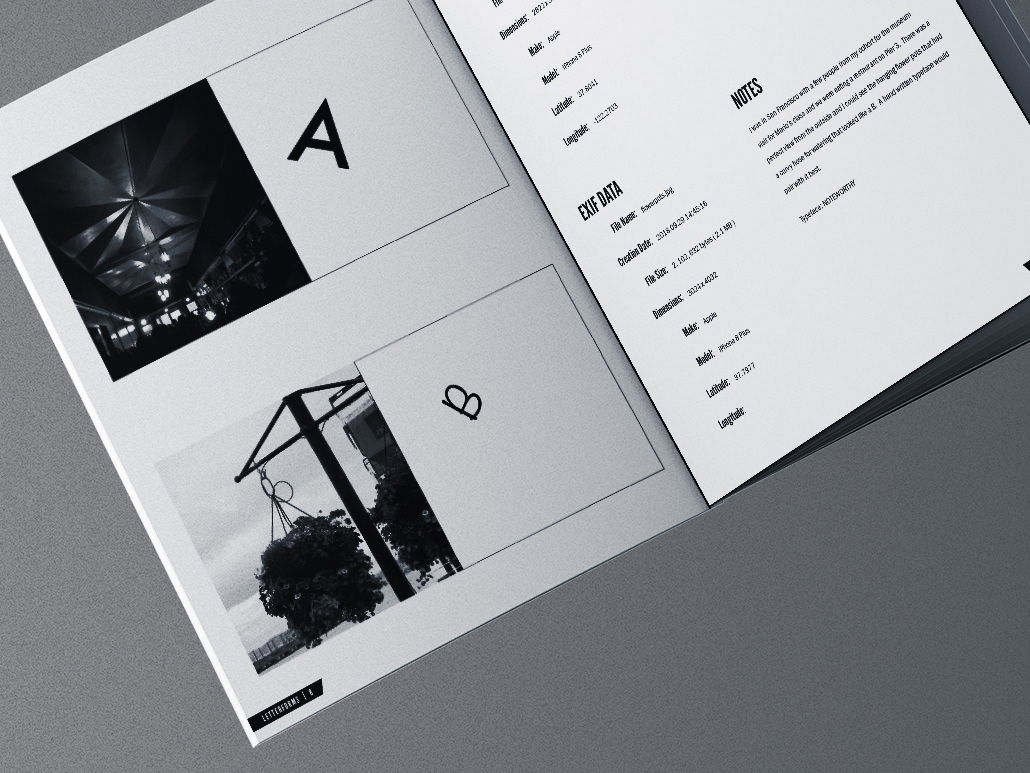
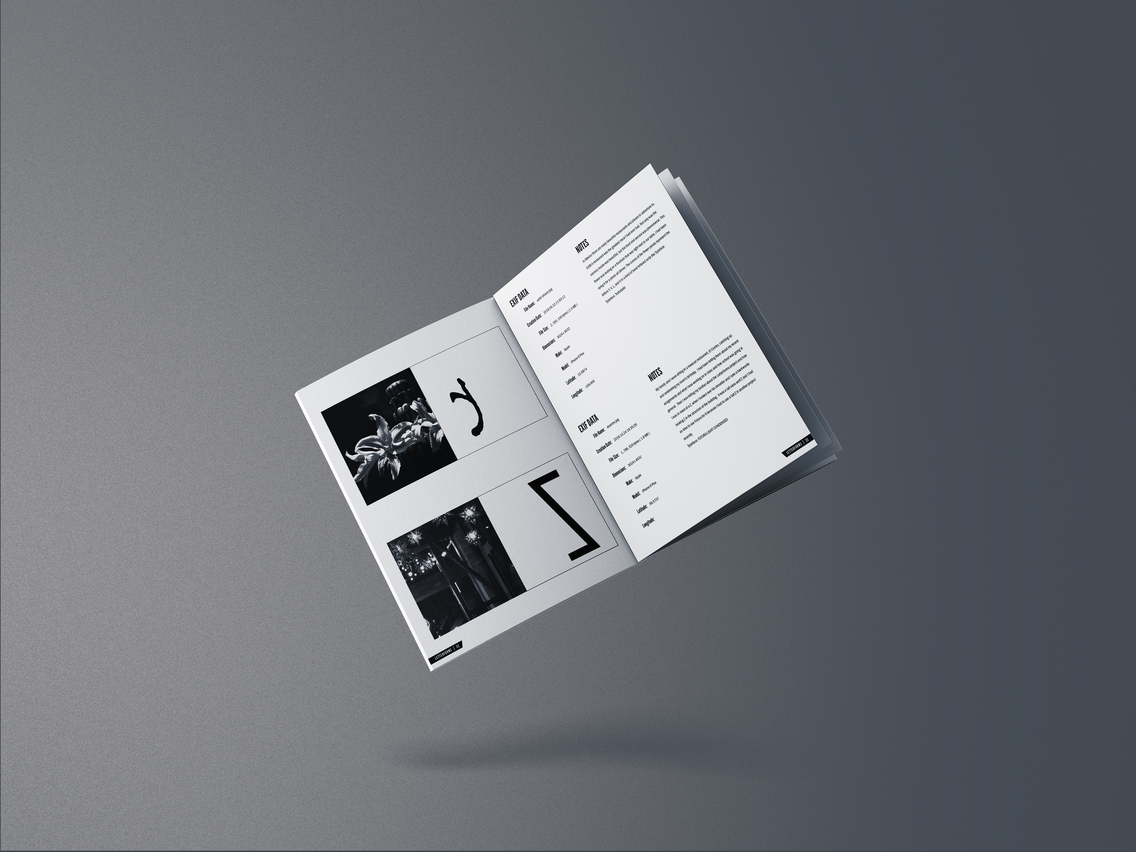
Throughout the my first semester of the Design Program, we had an ongoing assignment that was meant to help our eye become more aware of typography in everyday life. Using grayscale photographs I took throughout the semester, I composed a letter and its companion photo in a format that asserts the qualities of each. The photographs were to be cropped to a 4” x 4” next to the letter that was placed next to it. The letters are intended to draw the viewer’s attention to the area in the photograph that I wanted to emphasize. We were also required to provide a description and EXIF data about the photographs. When submitting the final project, we were required to compile it all in a book or binder. I enjoyed the project so much I wanted to make it into a saddle stitched magazine style which gave me the opportunity to design the covers and beginning pages in more detail as well as work with a printer and see the process of how magazines are created. This project was chosen to be presented in the 2019 Design Spring Show this May. We did research on the band and the album to further familiarize ourselves with their style. Then we did word and photography research to find the right look and feel for the spread. I chose to explore 'atmospheric' and images of fog. I had seen the band I chose play a show prior to beginning the project and was able to use photos I had taken of the show. It was really exciting for me to be able to use abstractions of my own photography from when I had seen the band play.To counter the organic images of fog I created sharp angles and interrupted shapes to make the design more dynamic.