
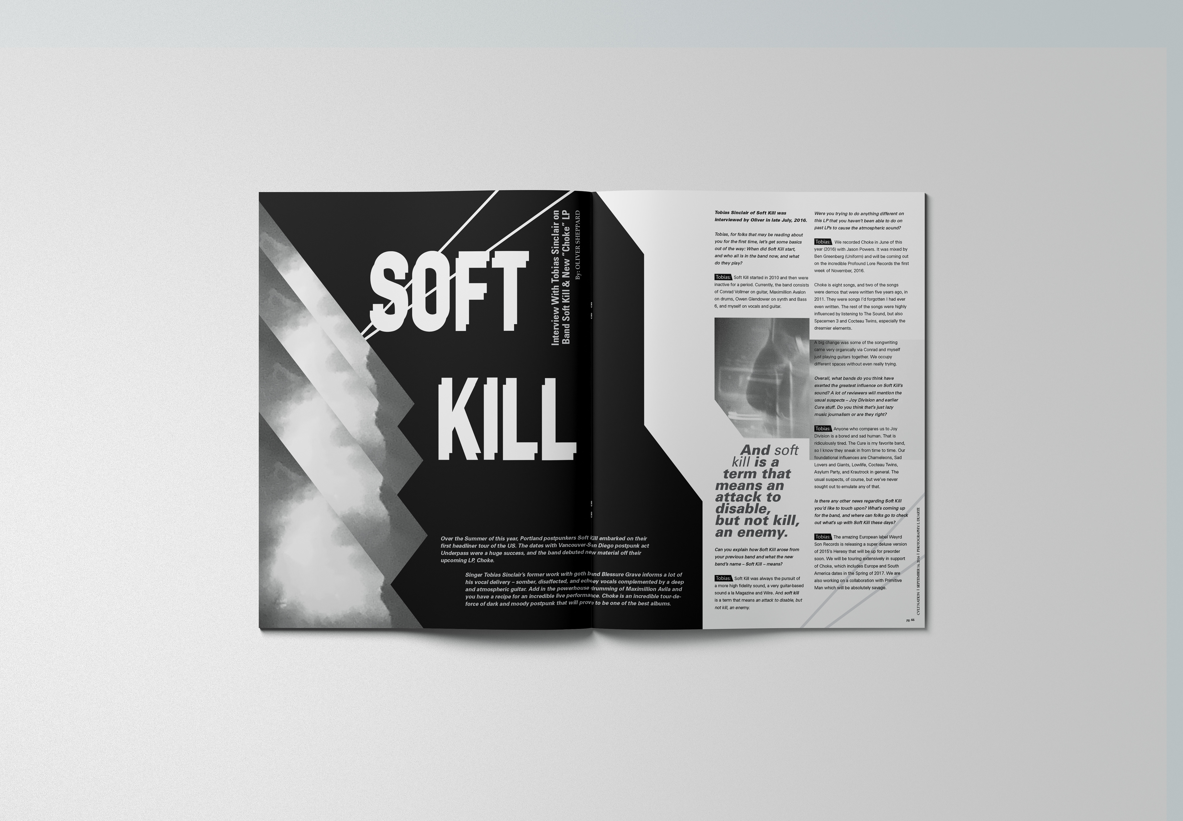

This magazine layout project is from my Typography 1 course I took during my first semester in the Graphic Design Program. The assignment was to choose a band and our favorite album from them, find an article about the album, and create an interesting layout using our own photography. We did research on the band and the album to further familiarize ourselves with their style. Then we did word and photography research to find the right look and feel for the spread. I chose to explore 'atmospheric' and images of fog. I had seen the band I chose play a show prior to beginning the project and was able to use photos I had taken of the show. It was really exciting for me to be able to use abstractions of my own photography from when I had seen the band play. To counter the organic images of fog I created sharp angles and interrupted shapes to make the design more dynamic.